
It’s just so obvious
Another Editorial by David Garofalo
I wrote an editorial back in July called “It Looks Familiar,” you can go back in the archives of The Cigar Authority or find it here; https://thecigarauthority.com/it-looks-familiar-a-david-garofalo-editorial/ . In that editorial which surprised some people, I asked the question if you ever looked at something you never saw before and thought, WOW… that looks very familiar. Sure you have, we all have, but in the cigar industry it happens an awful lot more than in other industries. There might be a very good reason for it… I think in most cases, they were done on purpose.
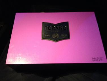
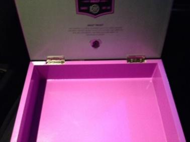
In the previous article I gave some pretty good examples and I thought maybe this would get some of the companies to slow down this blatant persistence but it hasn’t, as you will see in these exhibits. First, Exhibit A, the new look and style of General Cigars Torano Cigars. General cigar acquired Torano cigars from the Torano family in late 2014 and haven’t done much with it until now. (Exhibit A)

Now, it looks sleek and modern, the colors jump off the shelf and certainly get your attention. They might even get the attention of the lawyers from Davidoff, the owners of Camacho who a couple of years ago changed their packaging to a new and unique look shown here. (Exhibit B)
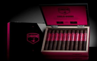
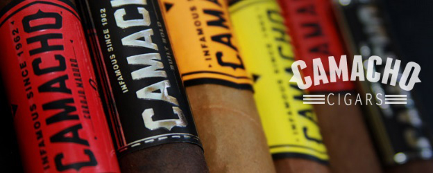
Not just the box, but look at those bands. Colorful with giant bold letters. Sideward lettering, even the arrow die cuts. Looks familiar, or does it look like a total rip off? The metal plate on the box, the thickness of the wood, you name it, this was no accident in my personal opinion.
So why would they do it. Laziness? Why recreate the mousetrap when it was already created. Confusion? Create confusion and get some of their customers who accidentally grab the other without realizing it is different.
Next we have the Warped Cigars, Exhibit C, from a small boutique brand owner who put a product out that at first glance I just knew I saw before. It wasn’t the product but the packaging. A limited release, numbered piece, pear-shaped humidified jar they called a Jaridor. Holds 25 Churchills 7” x 48. Black jar, red stripe… this one took me a while to figure out but it finally happened after a trip to Cuba this past week… there it was. Looks Familiar? It is the Partagas Series P Ceramic Jar, limited release from 2009.
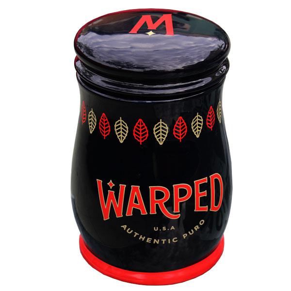
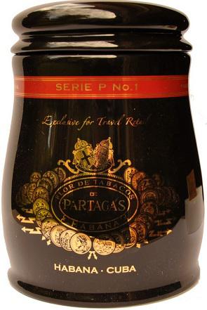
Maybe they are paying homage to this iconic brand, but if so they never mention it in the presentation or description. They had to recreate the mold or maybe they even used the same mold because it is pretty identical. Maybe they can steal the likeness because it’s a Cuban product and nobody will say anything, or maybe they hoped nobody would ever notice.
There are lots more examples I could mention but I think you get the message. I have a feeling there will be plenty more to discuss at a later date as manufacturers are putting product together for the upcoming IPCPR Cigar Trade Show in July right now. Before coming out with new products, maybe they should put it through what I like calling the sniff test first. If it smells like a blatant rip-off without concern to the original… it is. It just smells bad, and to me… it’s just so obvious.